US UK
Gina
US: I like the little design of the tent but i think that the hand looks a bit artoonish and i think it looks odd in a way. ut i love the swirls around the title, very pretty and elegant. I think the colours red, black and white look stunning together and i'm glad they kept the colour schemes the same for both covers!
UK: I love this cover!! I look the white silhouettes of the people with the birds and the magic equipment which plays a major part in this book. The red scarf, being the only thing red, stands out and has great signifigence in the story :) I love our title font and the stars surrounding it which gives in a very mystical and magical feel.
Conclusion: The UK wins this one! There is nothing bad about it at all!!
Katie
US: This is an okay cover, but I’m not that keen. I adore the design around the title but it would’ve looked even better if the title font was like the UK one and a lot bigger to make it stand a lot more. I like how this one has the stars in the background, but it’s slightly boring.
UK: I really like this cover, and I think that it’s better when you actually see the book in front in you. The main colours are black and white, yet it attracts your attention which is what I like about this cover. I love the font with the design of stars around which makes it more decorative.
Conclusion: it definitely has to be the UK cover that wins this cover battle. Even though the background for each is both black, the UK one seems more interesting. There is more design too. I suppose that’s what has drawn me to the UK. The design has obviously been thought out and it looks amazing considering there are only two colours!
I (Katie) have chosen Forgotten by Cat Patrick as i read it a while ago and really liked it!
US UK
Gina
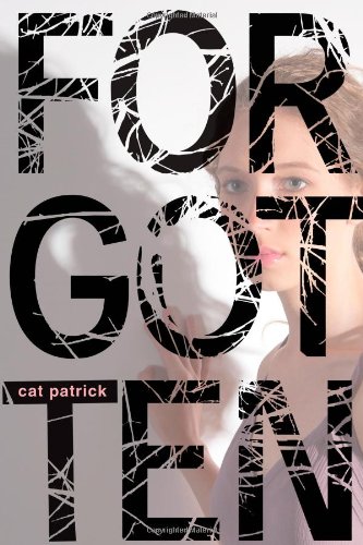
US: I love the font style of this book. It's scartchy and for some reason I've always like that sort of thing. But it also looks like cracks or tree branches, not sure yet. Not crazy about the model (mainly because we can't see her) but overall, this cover is nothing to be fussed over.
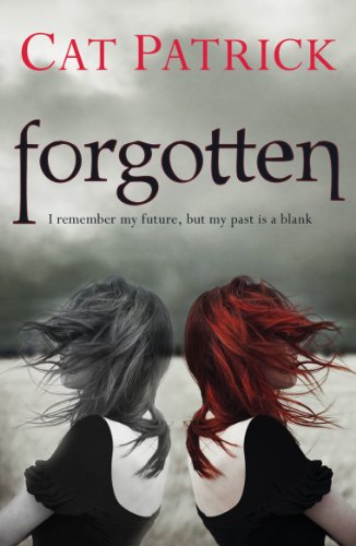
UK: I love the image of the model which has been reflected which i guess means her past and it's fading which might symbolise her forgetting it. I like the only main colour being her red hair which stands out. But just like the other it's nothing too special.
Conclusion: I think that the UK one is just that little bit better :)
Katie
US: This is an okay cover; I like how they have made the font fill the whole cover and make it really dramatic which I suppose could relate to the main character’s life in the book. I like how behind the title there is a girl with her shadow to the left which could relate to her past, she can’t see herself in the shadow which could probably be not knowing what happened in her past. I also like how the font is shattered-like as well!
UK: I love this cover! As I have read this novel (amazing, by the way!) I can relate to why they have made the cover like this. The model that’s looking left is looking towards her past but it’s in black and white because she can’t remember anything about it and the coloured model is looking to the right – basically meaning looking forwards, relating to the future – showing that she can see into the future. I loved this novel, and cover, so if you haven’t read it, please do because I thought that it was really good!
Conclusion: the UK cover wins because it appeals to me more.






0 comments:
Post a Comment